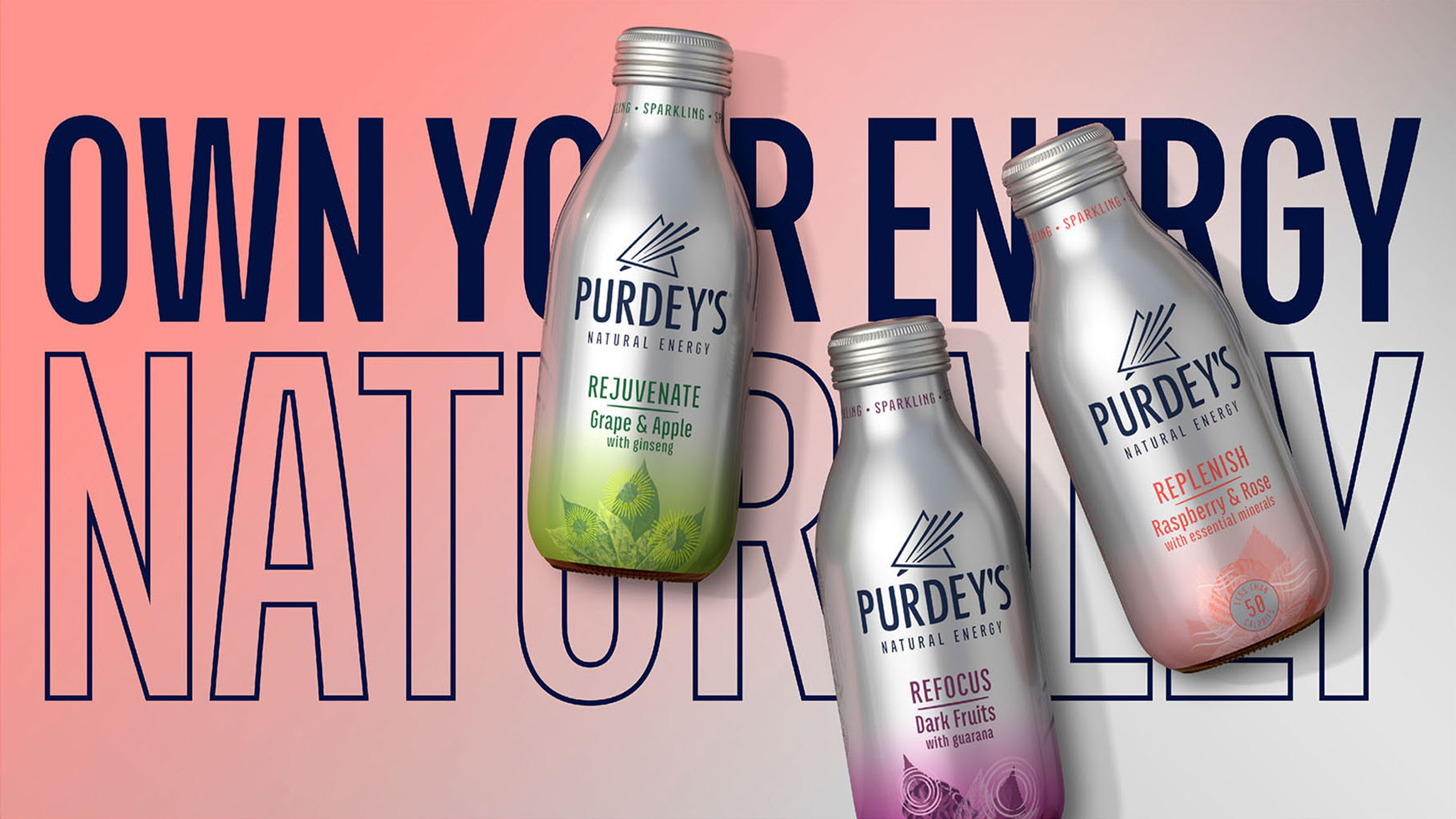
Natural Vitality

Natural Vitality

Purdey’s first made its mark in the late ‘80s and quickly became the rejuvenating tonic of choice for musicians of Abbey Road studios.

Whilst the original vitality drink had gained a cult following over the past three decades, Britvic were on a mission to grow the brand into a mainstream player.


To thrive within the natural energy space, Purdey’s needed to move away from dominant codes of caffeine-fuelled beverages. In other words, drive feeling over function.
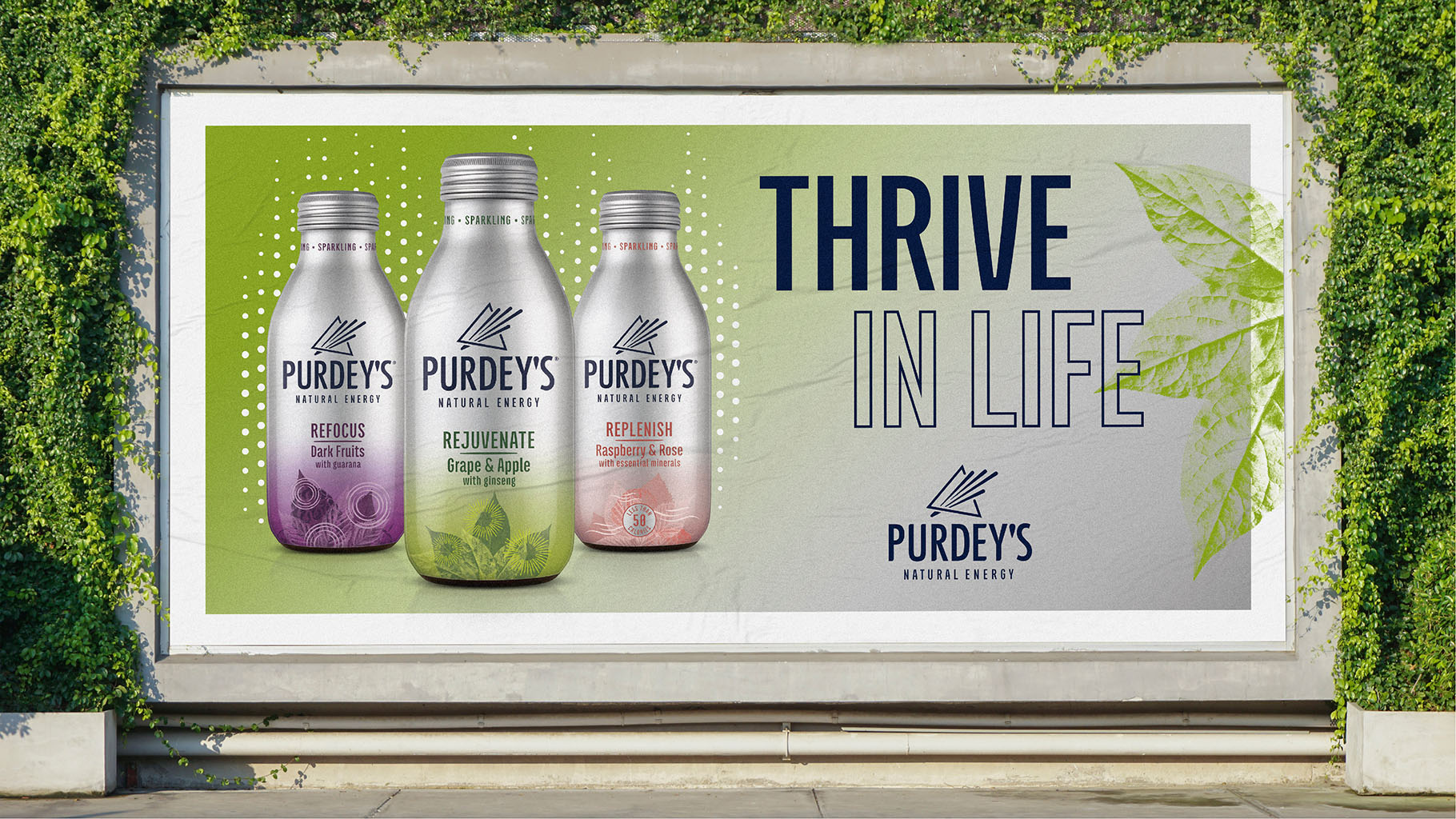
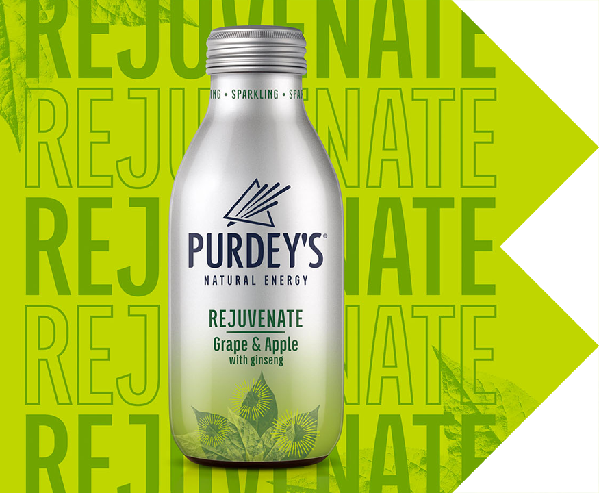
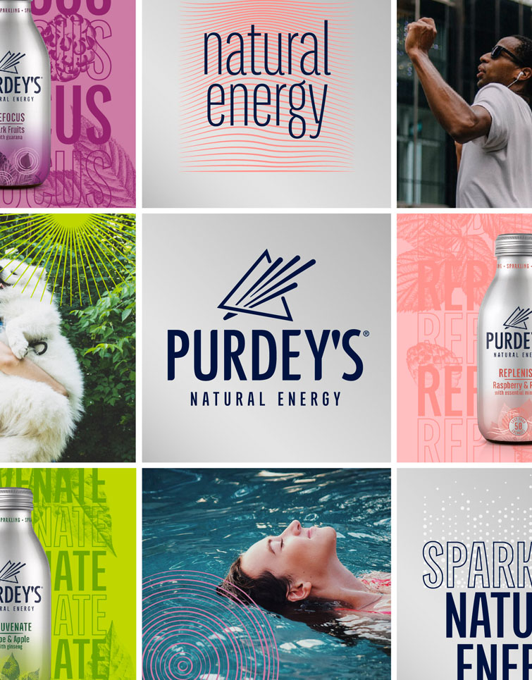
Refreshed and recharged, the bold identity introduces more meaning at a brand level through the transformative icon - the ‘Prism’.

It encapsulates Purdey’s unique take on natural vitality. Drawing inspiration from the drink’s feel-good energy and fresh fruity flavour, we introduced a sleek yet confident typeface, giving the overall look and feel a softer and brighter aesthetic.


Retaining the distinctive and premium core colour palette - the silver canvas - we overlaid it with pops of colour to inject a sense of liveliness, whilst a gradient style brings a ‘gentle lift’ of energy.


Paired with bold and abstract illustrations, the brand world cues the delicious fruitful flavours and emotional benefits of each variant, creating an ownable and dynamic treatment on shelf.


UTTERLY BUTTERLY