Blending Fire With Water

Blending Fire With Water

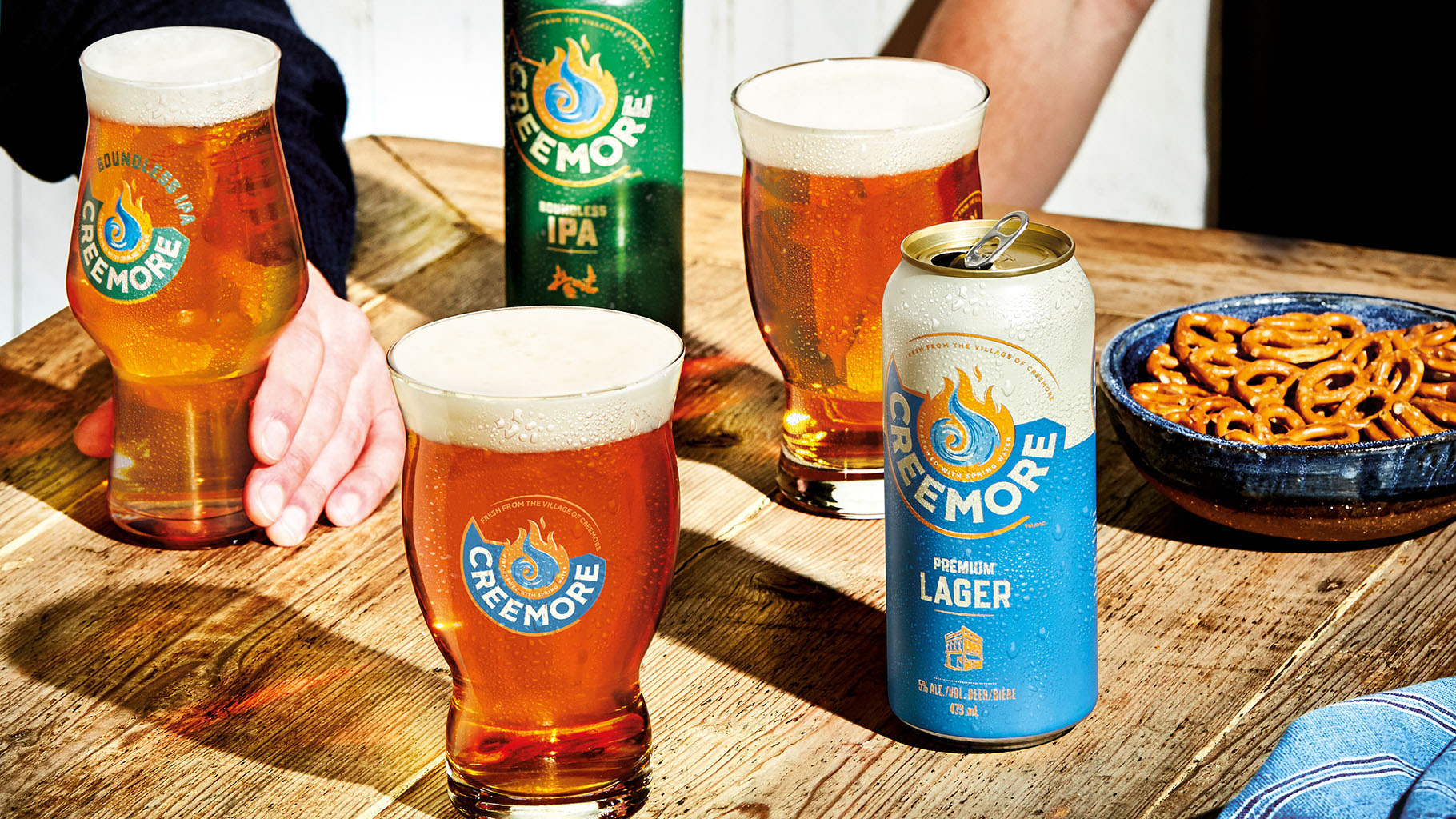
Creemore. A tiny quaint town nestled in Ontario, Canada with a brewery at the heart of its village.

Brewed with only the finest Creemore spring water, then fire-brewed in copper for complexity and taste, this imitable beer is loved for its depth and character. On a mission to drive reappraisal with current and new drinkers, Creemore Springs was eager to move away from the niche of the craft category. Without losing its rich foundations, small-town personality, and the spirit in which it was founded.


Creemore originates from the passion and entrepreneurial spirit of John Wiggins, who founded the brewery in 1987. A brand that is all about stoking the fire of inspiration and igniting the next possibility. We tapped into these core values with a visual identity that heroes Creemore’s unique blend of fire and water. Both elements are held within the circular blue ribbon, a nod back to the brand’s history as well as a forward arrow, symbolizing momentum and reinvention synonymous with the brewery.


Each pack contains an illustrated icon crafted to tell each individual beer’s story. A vibrant and engaging brand world is brought to life through a distinctive suite of assets. Including a crafted yet eclectic typography style, contemporary product lifestyle photography and energetic color palette. A suite of secondary elements add depth and communicate the people behind the brand through patterns and notations.


The new design has allowed the brand to successfully expand and innovate with seasonal and small batch offerings.


CRACKER BARREL