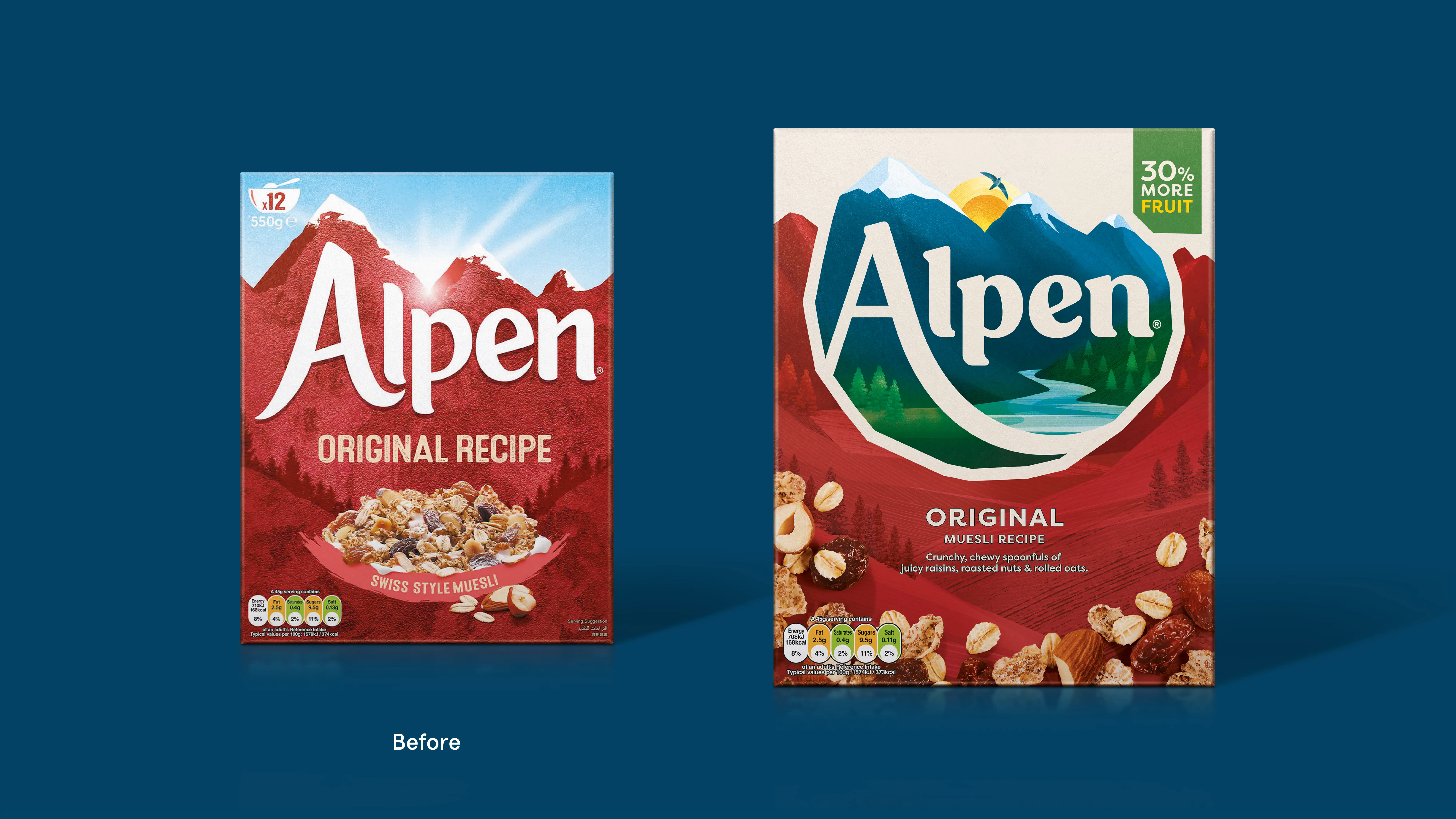
Alpen, the UK’s number one muesli brand, reveals a brand new recipe and redesign across its iconic muesli range. With muesli in decline and shoppers increasingly turning to granola and porridge, Alpen recognised the need to redefine muesli’s place at the breakfast table.
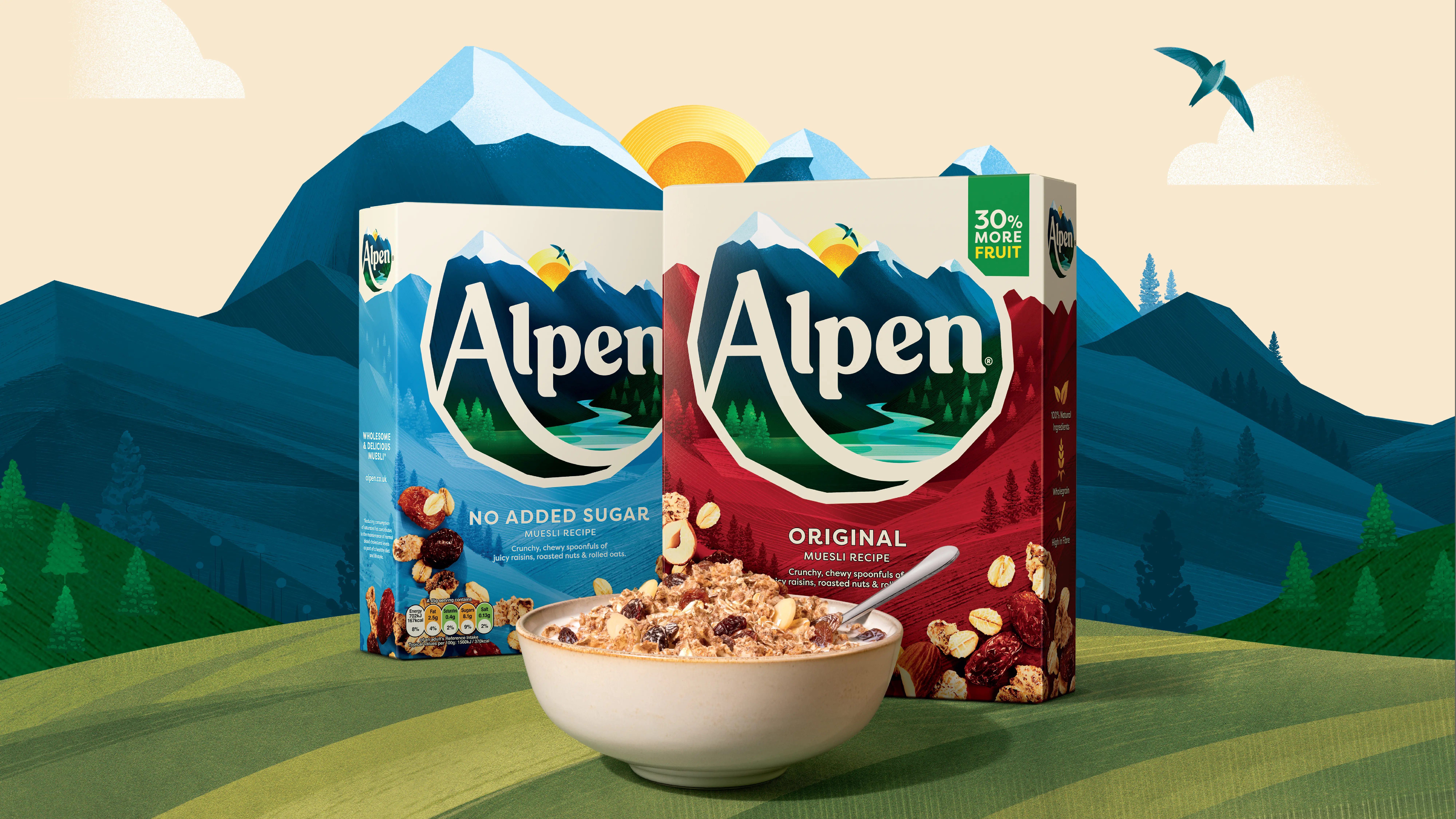
To lead this transformation, Alpen partnered with BrandOpus, a global branding agency, to create a new identity and packaging refresh that modernises the brand while maintaining its distinctive assets, such as its signature alpine landscape. The revitalisation also coincides with Alpen’s new recipe, now featuring 30% more fruit, reinforcing its position as a complete, delicious, and nutritious breakfast choice.
BrandOpus was tasked with driving reappraisal of Alpen, and in turn the muesli segment, by re-establishing its credentials as a tasty, natural, and wholesome way to start the day.The new creative approach, ‘Brimful of Life’, celebrates Alpen’s distinctive identity and reflects its unique position as a cereal that offers all-encompassing goodness. The flowing river, morning sun, and natural elements—trees, a bird, and lush greenery—now enrich the iconic mountainscape, creating a fuller alpine experience.
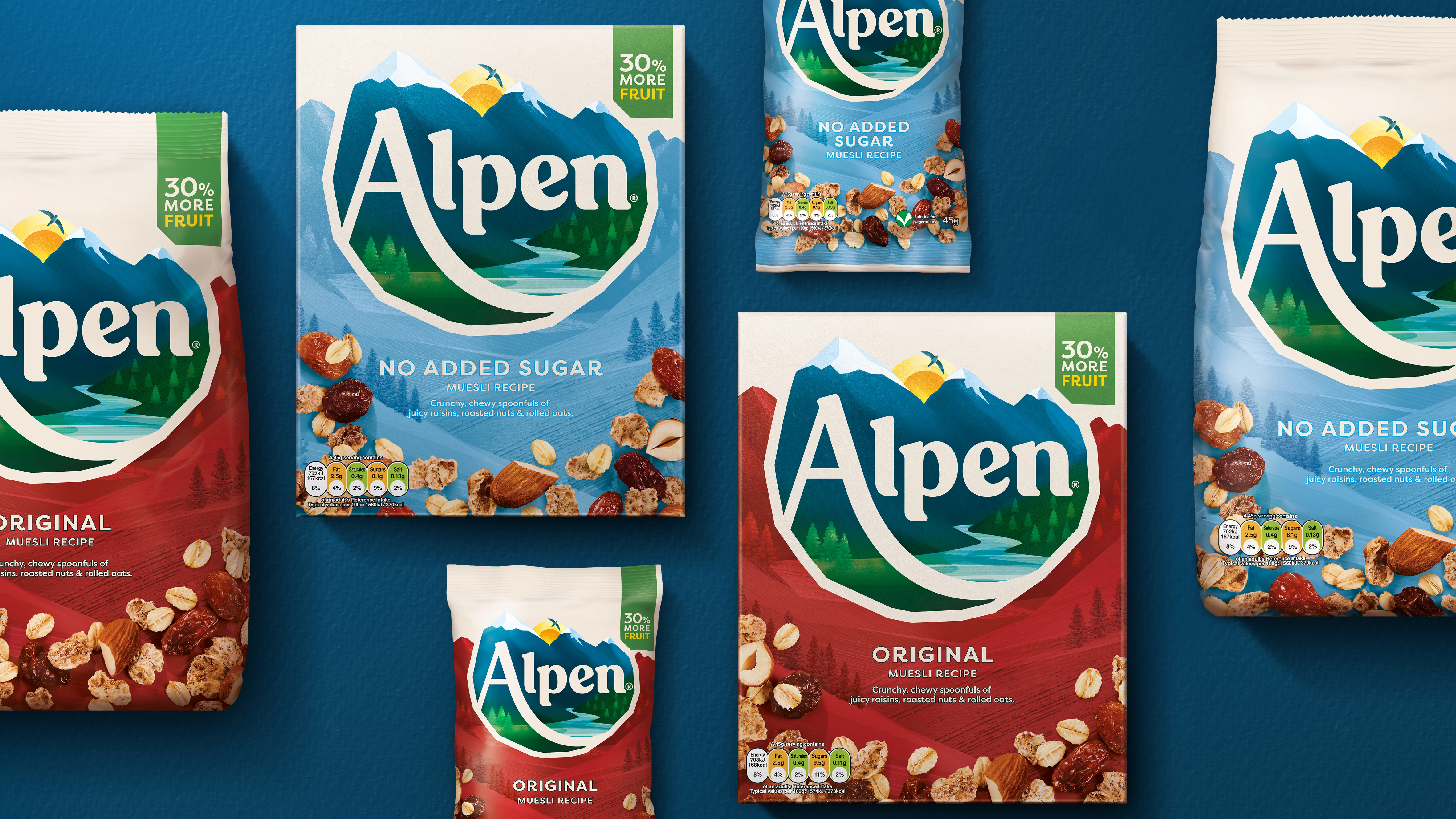
A bold, modern serif logotype—rooted in Alpen’s original archive pack—sits at the heart of the new identity. Paired with a warm, natural colour palette of creams, blues, and greens, it brings a sense of vitality and alpine wholesomeness to the design.The new identity has been rolled out across Alpen’s full product range and in-store materials, ensuring a cohesive and memorable shelf presence. The refreshed look aims to reclaim Alpen’s place as a category leader and inspire a new generation of consumers to rediscover muesli.
Wider details of the new identity system:
- Wordmark: The updated and fuller wordmark is now locked with a mountainside illustration, anchoring the brand more closely to its Alpine roots and creating a unified, consistent brand mark.
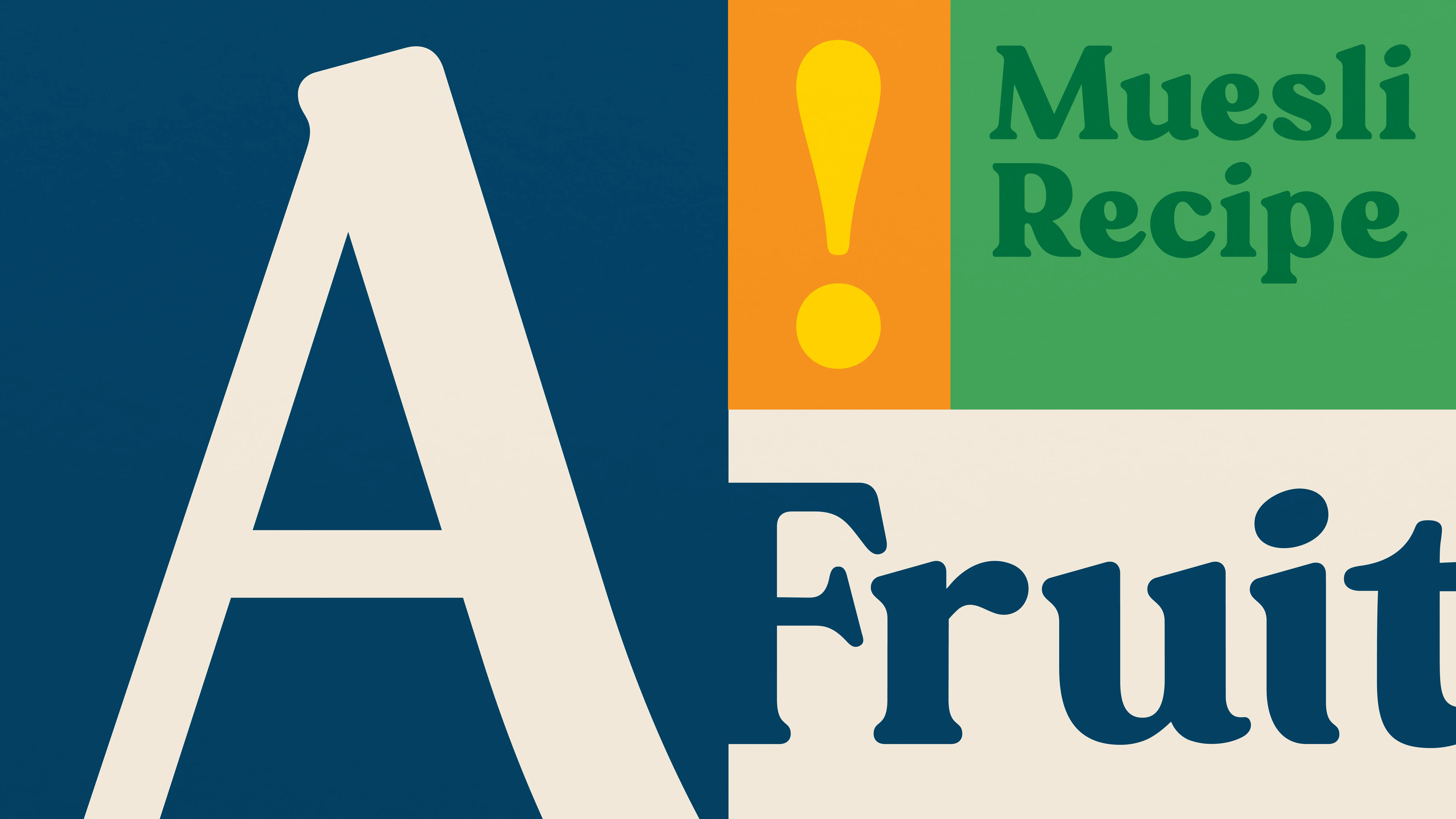
- Logotype: A chunky, modern serif wordmark inspired by Alpen’s original archive design, reflects completeness and the abundance of Alpen recipes.
- Colour: The primary masterbrand colour palette is formed of two key colours; Alpen Cream, which delivers a sense of naturalness and taste, and Alpen Blue, which reflects the iconic mountains and delivers strong quality signals.
- Illustrations: The new alpine illustrations style shifts consumer perception by moving away from a traditional depiction of the Alps and instead embraces a stylised interpretation that feels fresh and contemporary.
“The new redesign has brilliantly captured Alpen, strengthened our distinctive assets and modernised our identity and pack, whilst staying true to what we’ve always been about – wholesome Alpine goodness”, explains Francesca Theokli, Marketing and NPD Director at Weetabix.
Louise Vickers, Head of Brand at Alpen, said: “We’re proud to finally reveal our new look and recipe for Alpen, to rekindle that enjoyment of breakfast for Muesli lovers nationally.
Through a major investment into our product, our packaging and brand, we want to inspire UK consumers who are looking for a naturally delicious, wholesome start to the day that fits with their lifestyle.This is a significant new direction for Alpen and what we hope to be a welcome boost to the Cereals category.”
“While mountains have always been a key element of the brand’s identity, we reimagined its illustrations style to embrace a more stylised interpretation that feels fresh and modern”, says Daniel Wegrzyn, Business Director at BrandOpus.
See our more here.