Bringing Storytelling To The Table

Bringing Storytelling To The Table

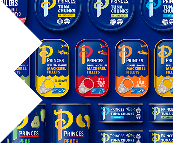
Originating from the shores of Liverpool, Princes has been a household name in British homes for over 120 years.

But despite a rich and long-standing history, shifts in category and consumer attitudes towards fresher ingredients meant that Princes was beginning to feel out of step.


Our challenge was to re-energise and reframe perceptions around canned food, re-establishing Princes as the proud and iconic cupboard staple for today’s modern family.


Princes has always been about pride in the food they provide, so we set out to hero this through a more contemporary look and feel.

At the heart of the identity is the illuminated ‘P’ symbol – crafted to be a proud beacon in the cupboard. The illuminated letter design is both a nod to traditional recipe books and old fairy tales that signal the beginning of stories.


Throughout the portfolio, we kept the masterbrand blue but modernised it. Replacing the dated metallic glow, with a punchier bold tone that can flex across the extensive portfolio. Paired with bright accent hues, the range becomes a sea of colour - popping on shelf and delivering vibrancy to the ambient food aisle.


Handcrafted illustrations, including stylistic fish and fruit, have replaced old-fashioned product photography to inject a dose of charisma and playfulness.


“The BrandOpus team understood the need to stand out amongst many new entrants and identified a unique brand purpose to tap into a growing flexitarian audience, resulting in Plot 9 outperforming the market leader on packaging appeal.”

Jessica Duckworth, Innovation Manager (Food & Drinks)
Princes

RUSTLERS