Reviving An Icon

Reviving An Icon

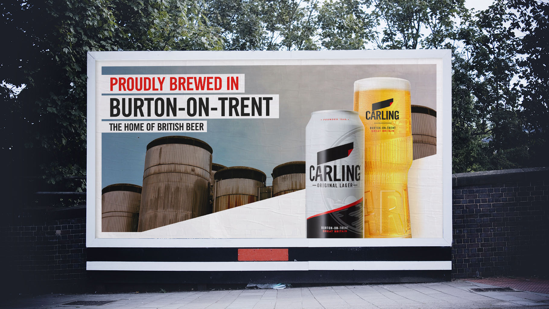
Despite being the No. 1 mainstream lager in the UK, Carling and the category, were under significant threat.

An attempt to premiumise meant the brand had lost some of its core equities. We needed to bring Carling back to doing what it did best; being a simple, uncomplicated beer that brings people together. Again, and again.


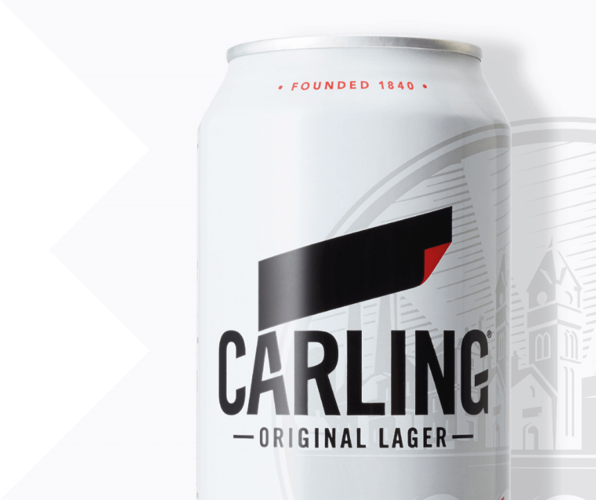
We crafted a new identity that reinforced Carling’s role of being genuine, dependable and unpretentious. We began by reimagining one of the brand’s core equities, the iconic black label. Removing it from the wordmark allowed it to become confident and disruptive, both on the shelf and the bar.


Paying homage to the notion of communities, by celebrating Carling’s own, the historic brewing town of Burton, where the beer is still manufactured today is celebrated by a distinctive watermark. We introduced a new typeface and confident pared back colour palette to bring modernity.


To cement Carling’s role in people’s lives, we took the evolution a step further by creating an innovative new pint glass that encouraged the shared experiences that are synonymous with the brand.


If there’s one thing that defines going to the pub with friends, it’s getting a round in.

But getting a round in can be time consuming, meaning shared conversations and experiences are missed out with mates.


Launched in pubs nationwide, the revolutionary new glass was ergonomically designed with vertical grooves to interlock with other Carling glasses and an embossed lettering created a tactile grip. Paired with a bespoke shape that was wider at the top and thinner towards the middle, meant there was a natural gap for hands to easily wrap around, whilst a nucleated bottom kept crisp pints fresher for longer. All in all, easier to carry more pints in one go.


Cheers to that.

PRINCES